ARTWORK GUIDELINES.
To ensure your custom packaging prints exactly as envisioned, please follow these artwork preparation guidelines. Submitting print-ready files that meet our specifications helps us deliver accurate color reproduction, sharp details, and flawless finishing on every order.
1. Overview
Every custom packaging project begins with artwork. Whether you are a graphic designer, brand manager, or first-time packaging buyer, understanding how artwork translates from screen to printed product is essential. Packaging printing uses different technologies than office or home printers, and files must be prepared accordingly.
Our guidelines below apply to all custom box orders, folding cartons, corrugated mailers, kraft packaging, and specialty packaging. Following these specifications ensures your branding, colors, and imagery appear exactly as intended on the final product.
Need help with your artwork?
Our in-house design team provides free dieline templates and artwork assistance for every order. If you are unsure about any specification, contact us before submitting your files — we are happy to help.
2. File Formats
We accept a wide range of file formats. However, not all formats are created equal for print. Below is a breakdown of acceptable formats, ranked from best to acceptable:
Vector Formats — AI, EPS, SVG, PDF
Vector files use mathematical paths instead of pixels, meaning they scale infinitely without losing quality. These are ideal for logos, text, illustrations, and any artwork with clean lines or solid colors. Always export vectors with all fonts outlined (converted to outlines/paths).
High-Resolution PDF — PDF/X-1a or PDF/X-4
PDF is the industry standard for print-ready files. Use PDF/X-1a (flattened) or PDF/X-4 (with transparency) presets from Adobe Acrobat or Illustrator. Ensure all images are embedded at 300 DPI minimum and all fonts are outlined or embedded.
Raster Formats — PSD, TIFF, PNG (300 DPI minimum)
Raster images are pixel-based and must be provided at the final print size with a resolution of at least 300 DPI. For large-format packaging, 150 DPI may be acceptable depending on viewing distance. Always flatten layers before submitting.
JPEG, BMP, GIF, WEBP, Screenshots
Low-resolution formats, web images, and screenshots cannot be used for print. JPEG files suffer from compression artifacts that become visible on printed packaging. Screenshots capture screen resolution (72-96 DPI), far below the 300 DPI required for print.
3. Color Modes
Packaging printing uses subtractive color mixing (CMYK), not additive color mixing (RGB). This fundamental difference means colors on your screen will not always match the printed output exactly.
CMYK (Print Standard)
- • Cyan, Magenta, Yellow, Key (Black)
- • Used for all standard offset and digital printing
- • Set your color mode to CMYK before designing
- • Rich black: C=60 M=40 Y=40 K=100
- • Standard black: K=100
Pantone (Spot Colors)
- • Pre-mixed inks for precise, consistent color
- • Ideal for brand colors that must match across runs
- • Use Pantone Solid Coated (C) for glossy/coated stocks
- • Use Pantone Solid Uncoated (U) for matte/kraft stocks
- • Specify Pantone numbers in your artwork file
Why CMYK Matters
RGB screens can display vibrant blues, greens, and neons that simply cannot be reproduced in CMYK ink. Converting your file from RGB to CMYK before submission prevents unexpected color shifts. If your brand uses a specific Pantone color, we recommend using Pantone spot colors for maximum accuracy.
We perform a free color proof review on every order. If your submitted artwork is in RGB mode, we will convert it to CMYK during prepress — but we strongly recommend converting it yourself first to preview accurate colors.
4. Fonts & Typography
Fonts are one of the most common sources of print errors. When fonts are not properly outlined or embedded, they may substitute with a default font, causing layout shifts and readability issues.
Convert Fonts to Outlines
Before submitting your artwork, convert all text to outlines (also called "create outlines" or "convert to curves"). This transforms editable text into vector shapes, ensuring your typography appears exactly as designed.
Adobe Illustrator: Select all text → Type → Create Outlines (Ctrl+Shift+O)
Adobe InDesign: Select all text → Type → Create Outlines (Ctrl+Shift+O)
Minimum Font Size
For legibility on printed packaging, we recommend a minimum font size of 7pt for body text and 5pt for fine print (terms, ingredients, disclaimers). Fonts smaller than 5pt may become difficult to read, especially on textured or uncoated stocks.
Font Weight and Spacing
Thin and ultra-light fonts may appear fine on screen but can break up or become invisible when printed, especially on kraft or uncoated materials. Use regular weight (400+) for body text and medium/bold (500-700) for headings. Slightly increase letter spacing for small uppercase text.
5. Dielines & Templates
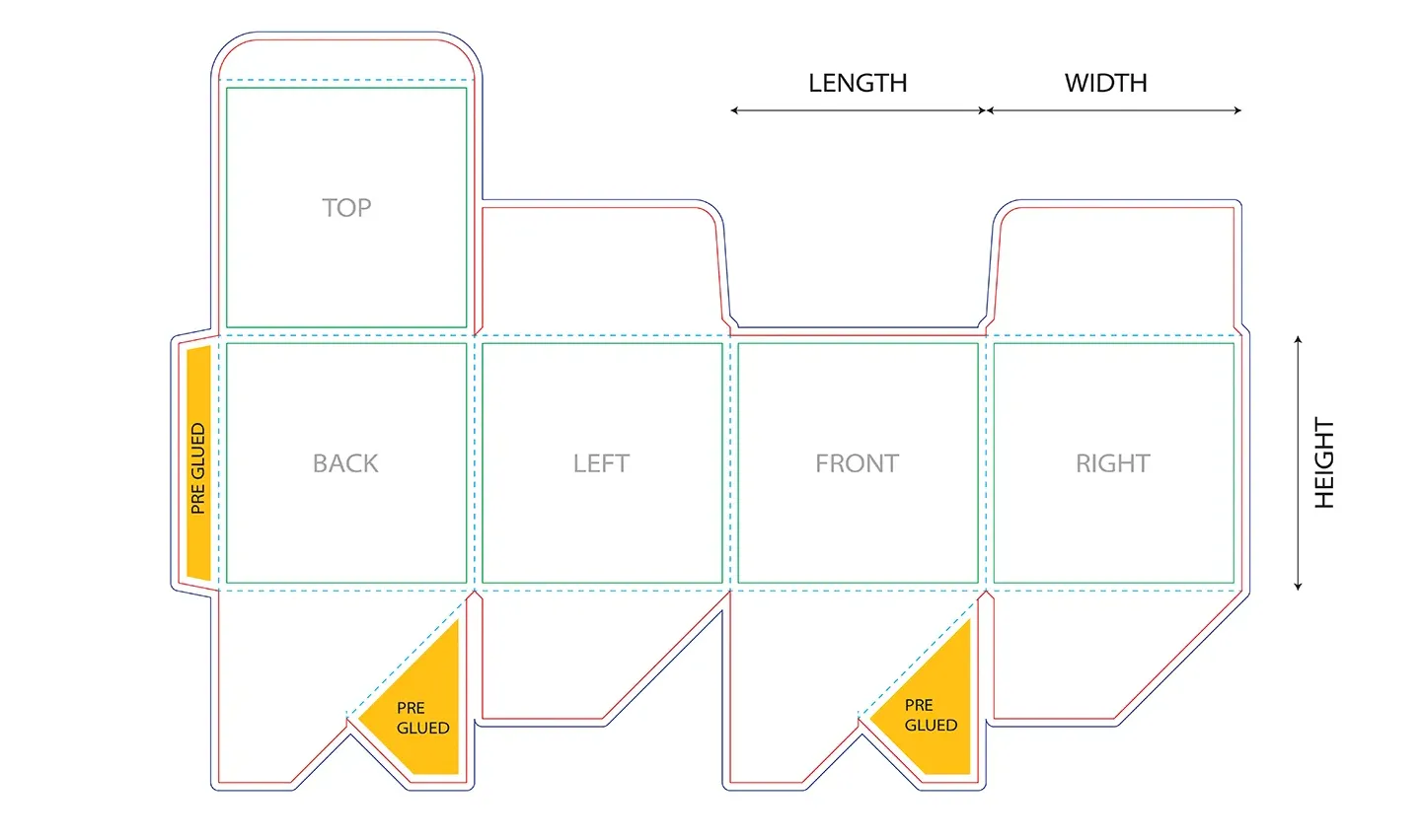
A dieline is a flat template showing the exact dimensions, fold lines, cut lines, and bleed area for your packaging. Designing on the correct dieline ensures your artwork aligns perfectly with the physical structure.
Free Dieline Templates
We provide a custom dieline template for every order, free of charge. After you place your inquiry, our design team will send you a print-ready PDF and AI dieline file tailored to your chosen box style, dimensions, and material.
Dieline Color Coding
- Red lines — Cut lines (final trim edge)
- Cyan lines — Fold lines (creases)
- Green lines — Safe area / tabs
- Navy lines — Bleed boundary
Working with Dielines
- • Keep the dieline on a separate, non-printing layer
- • Never scale or resize the dieline template
- • Design at 100% actual size (not scaled down)
- • Extend backgrounds 3mm beyond cut lines
- • Check alignment before final export
6. Bleed & Margins
Bleed is the area of your artwork that extends beyond the final cut edge of the packaging. It ensures no white edges appear after trimming, accounting for slight variations in the cutting process.
Standard Bleed
On each side (top, bottom, left, right)
Safe Zone
Keep critical content inside this margin
Folding Tolerance
Keep text/logos away from fold lines
Full-Bleed Backgrounds
If your design includes a color, image, or pattern that extends to all edges of the packaging, extend it 3mm beyond each edge on all sides. This prevents unprinted white slivers after trimming.
Critical Content Placement
All text, logos, barcodes, and important design elements should be placed at least 5mm (ideally 10mm) inside the trim line. This prevents content from being cut off during trimming or lost in fold creases.
Fold Lines and Glue Tabs
Avoid placing text or critical imagery directly over fold lines. Folding creates a crease that can crack ink and distort fine details. Leave at least 10mm clearance from any fold line for text and logos. Glue tabs should remain unprinted or contain only background patterns.
7. Resolution
Resolution determines how sharp and detailed your printed artwork will appear. It is measured in DPI (dots per inch) or PPI (pixels per inch).
Standard
Standard print quality. Required for all close-view packaging including small boxes, retail boxes, labels, and cartons. All text, logos, and images must be at least 300 DPI at actual print size.
Acceptable
Acceptable for medium-view. Corrugated boxes and display packaging viewed from a moderate distance can use 200 DPI for background images or full-bleed photos.
Minimum
Minimum for large-format. Oversized shipping boxes, pallet wraps, and large display bins viewed from several feet away. Not suitable for small text or fine details.
Common Mistake: Upscaling Low-Res Images
Enlarging a 72 DPI web image to 300 DPI does not improve quality — it simply interpolates pixels, resulting in blurry, pixelated prints. Always start with high-resolution source files.
8. Special Finishes
Special finishes add tactile and visual depth to your packaging but require additional artwork preparation. Each finish has specific requirements to ensure clean application.
Foil Stamping
Provide foil areas as a separate vector layer using a solid, spot color. Minimum line thickness: 0.5mm. Minimum text size: 8pt.
Spot UV / Varnish
Submit Spot UV artwork as a separate vector layer using a solid black fill on a transparent background. Avoid fine details under 0.3mm.
Embossing & Debossing
Provide emboss/deboss areas as a separate vector layer using a solid spot color. Minimum line thickness: 0.8mm.
Soft-Touch / Matte Lamination
No additional artwork layer is needed. Simply indicate in your order notes which areas require matte or soft-touch lamination.
Holographic / Metallic Effects
Provide holographic areas as a separate vector layer. Specify whether the effect should be cold foil, hot foil, or printed holographic film.
QR Codes & Barcodes
Generate QR codes at a minimum size of 15mm x 15mm with at least 25% error correction. Use solid black on white. Barcode minimum width: 30mm.
9. Common Mistakes
Avoid these frequent artwork issues to prevent delays and reprints:
Submitting RGB artwork for CMYK printing
Convert to CMYK before submission
Using low-resolution images (72-150 DPI)
Use 300 DPI minimum at actual print size
Forgetting to outline fonts
Convert all text to outlines before export
No bleed area on full-bleed designs
Extend artwork 3mm beyond each edge
Placing text too close to fold lines
Keep text 10mm+ away from any fold
Designing on the wrong (or no) dieline
Always use our provided dieline template
Submitting JPEG screenshots of logos
Use vector AI, EPS, or high-res PDF files
Gradients in foil or Spot UV layers
Use solid spot colors only for finishes
Tiny QR codes or barcodes
QR: 15mm min. Barcode: 30mm min width
No proof review before approving print
Always review and approve the digital proof
Ready to Submit Your Artwork?
Our design team reviews every file before production. Fill in the details below and attach your artwork file.
Frequently Asked Questions
Everything you need to know about preparing and submitting your artwork for custom packaging printing.